CLIENT
SB&A
PROJECT
Rebrand
ROLES
Creative Direction
Design
AGENCY
Soubriet Byrne & Associates
OVERVIEW
At Soubriet Byrne & Associates, it was time for a rebrand. The agency was moving into a new phase and needed an identity that would better represent itself moving forward. It was time to say goodbye to the logo which had distinguished the agency since its inception.
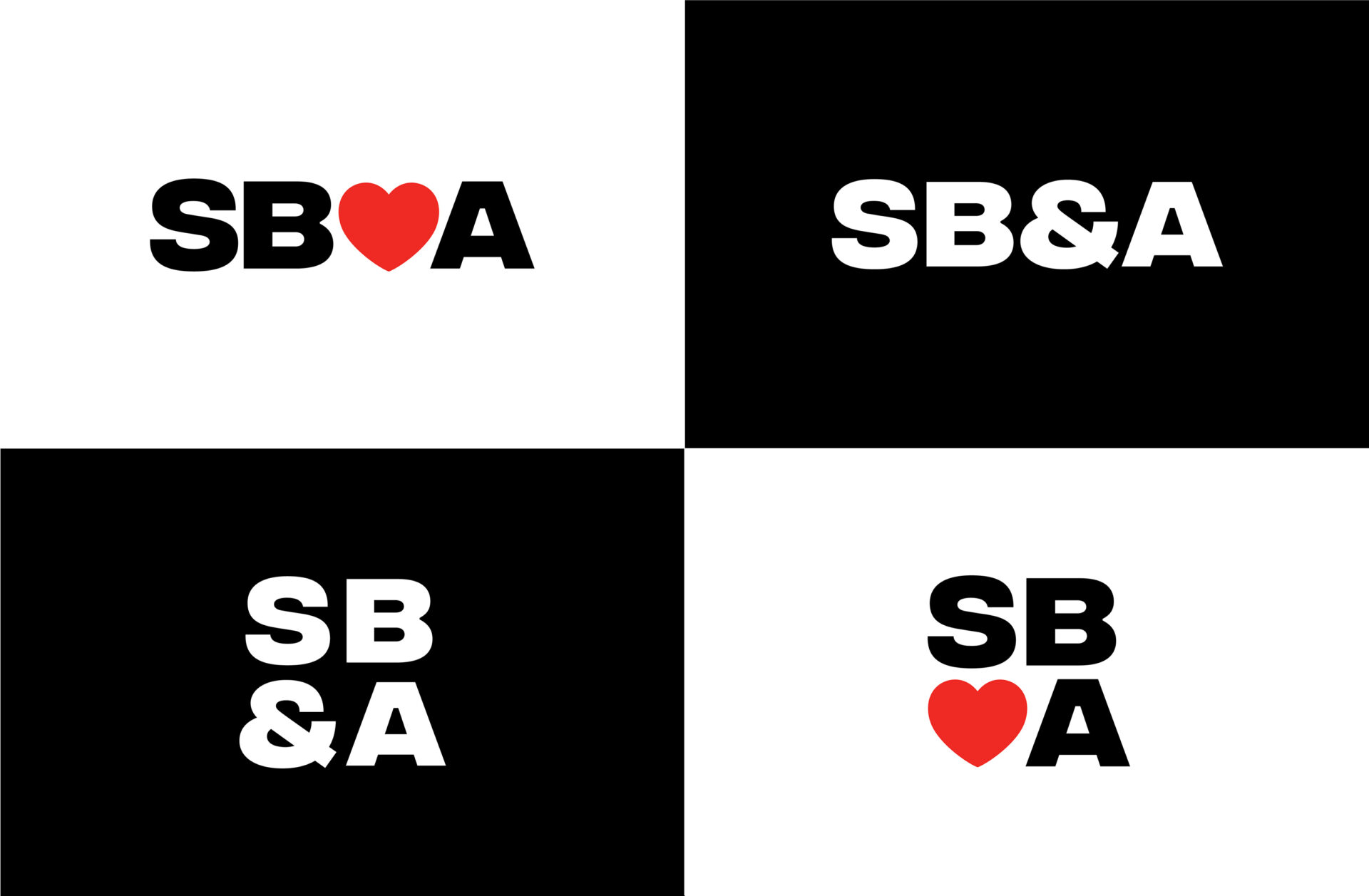
From the beginning, we knew it was important to highlight the collaborative nature of the agency. As we played around with the name of the company, broke it down and put it back together, it made sense to reincorporate the ampersand into the abbreviated version of the name, so that it would become SB&A. The ampersand symbol is full of opportunities for creative play–it brings an exciting new shape to the identity and represents the way the agency works in tandem with others.
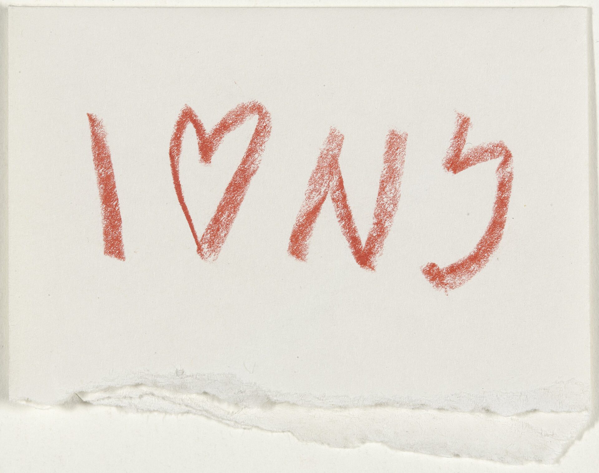
The agency has been New York-based since day one and it was important to highlight this in the identity too, as it has been integral in shaping the agency over the years. We looked back to the iconic “I Love NY” mark designed by Milton Glaser, and we were struck, as always, by the simplicity and effectiveness of it. It also brought our attention to the fact that the new name, SB&A, had 4 figures and therefore new opportunities to configure the logo. It became a starting point for us to design the stacked version of the logo in which the ampersand can be used interchangeably with a heart.
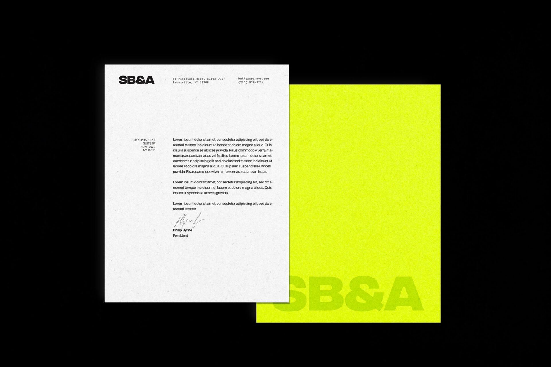
It was important that we design a mark that could stand the test of time, in the same way the previous logo did. We wanted a graphic, bold mark that veered away from mimicking current trends, and would be able to sit beside contemporary and vintage brands seamlessly. And so we landed on the final form of the logo, using the font Integral CF, which is impactful, solid and versatile.
The color palette is one of my favorite parts–this was an opportunity to really expand the brand identity in a new way for the agency. We wanted to find a palette that could adapt to every application and particularly pop in digital executions. The contrast between bright and dark colors and the infinite unexpected color combinations available make it an exciting group to work with. It adds a whole new dimension to the branding and we love it.
INDUSTRY
Advertising
DATES
2023
Original logo
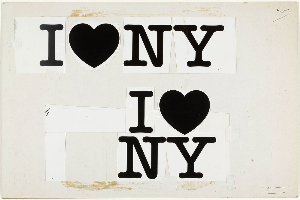
Milton Glaser's original sketches and compositions for the I Heart NY mark
Early sketches for the SB&A logo evolution